Step 1
Install in your client
Config is the same across clients — only the file and path differ.
CD
Supported in Claude Desktopstdio · Node 18+
Paste into ~/Library/Application Support/Claude/claude_desktop_config.json
{
  "mcpServers": {
    "visualization-mcp-server": {
      "args": [
        "matplotlib"
      ],
      "command": "uvx"
    }
  }
}
Are you the author?
Add this badge to your README to show your security score and help users find safe servers.
Embed in your READMEAbout badges →
[](https://mcppedia.org/s/visualization-mcp-server)
Read me
What Visualization Mcp Server does
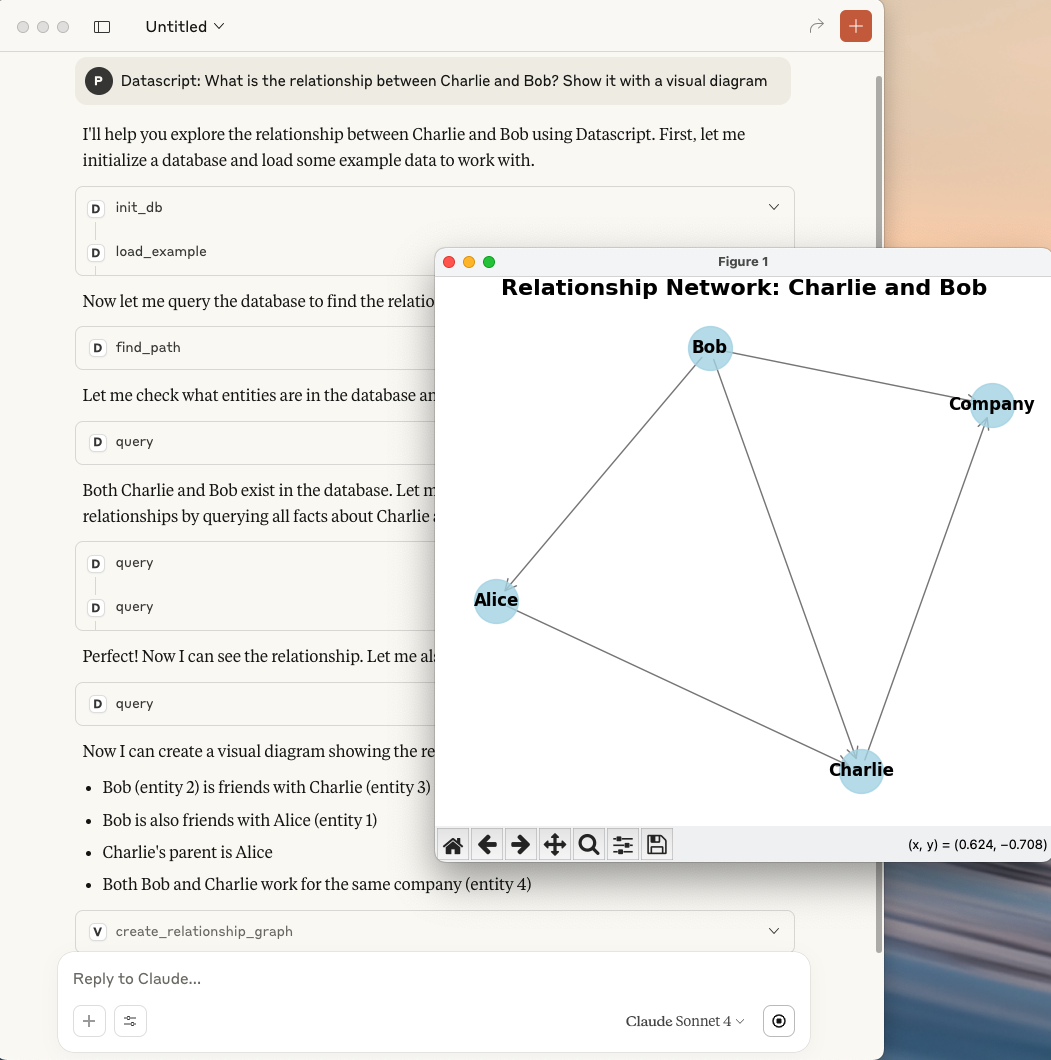
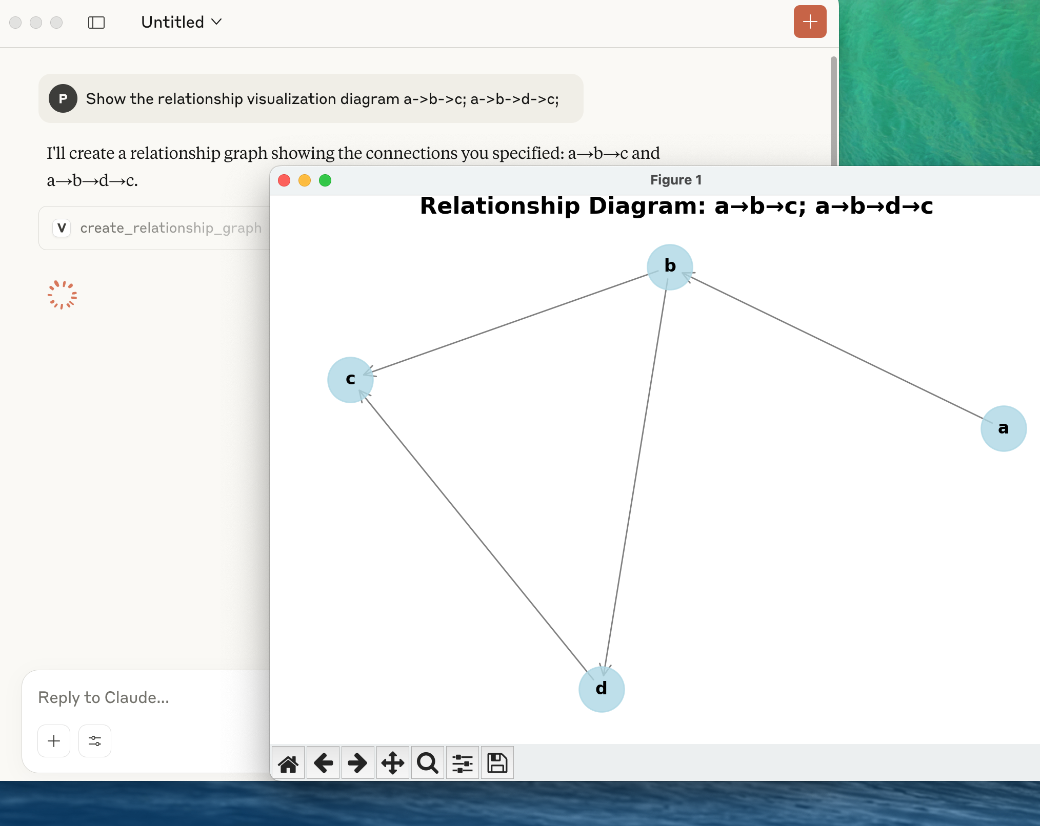
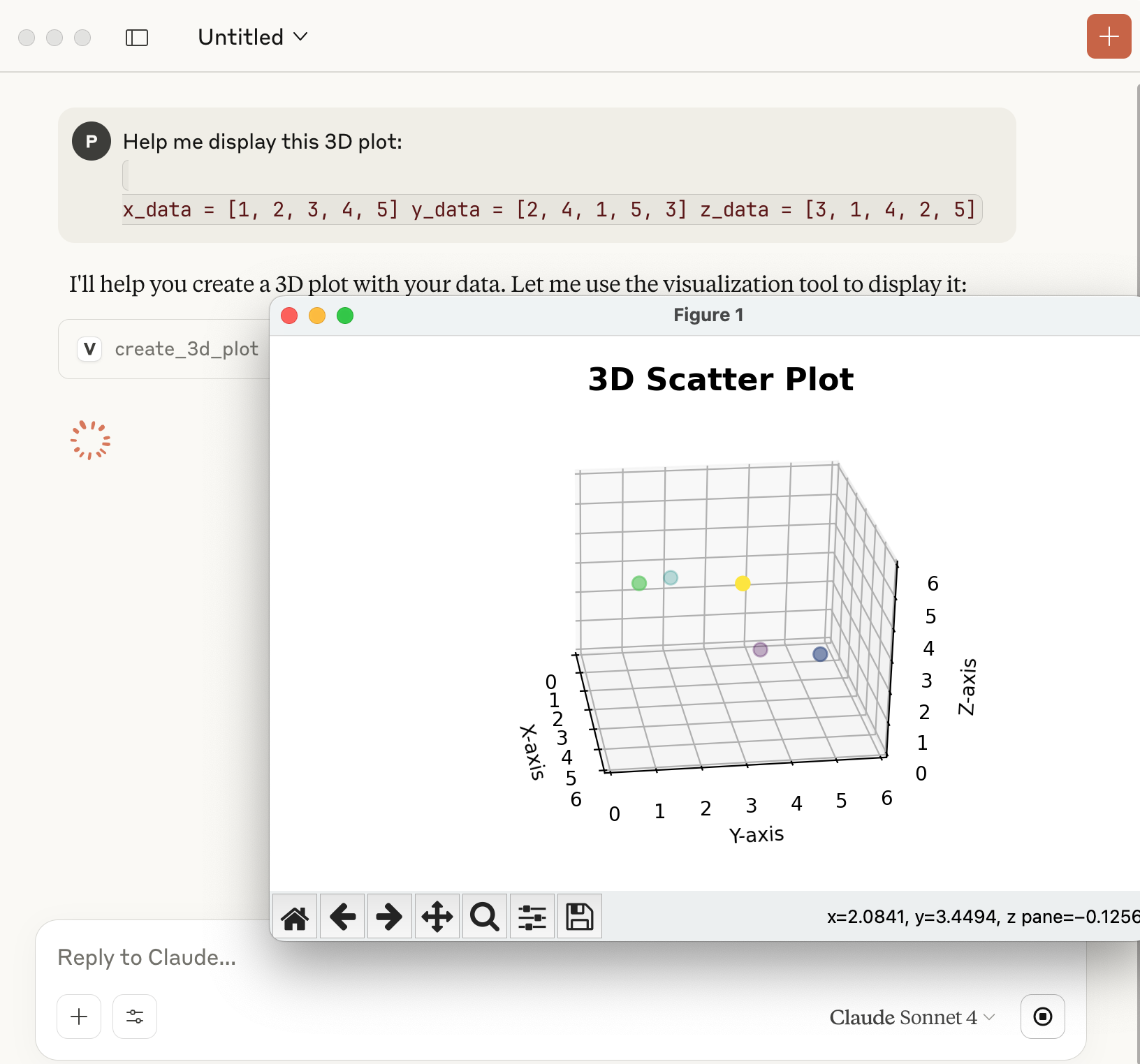
A powerful Model Context Protocol (MCP) server for creating interactive data visualizations using matplotlib. This server provides comprehensive visualization tools including relationship graphs, scatter plots, 3D visualizations, and more.
Test This Server
Run this in your terminal to verify the server starts. Then let us know if it worked — your result helps other developers.
uvx 'matplotlib' 2>&1 | head -1 && echo "✓ Server started successfully"
After testing, let us know if it worked:
Loading README…
Scored, not listed
Why this score
Five weighted categories — click any category to see the underlying evidence.
Score breakdown
74/100across 5 weighted dimensions
0255075100
30
16
15
10
−26
Security
Maintenance
Efficiency
Documentation
Compatibility
Categoriesclick a row to see evidence
Security
OSV.devNo known CVEs.
Checked matplotlib against OSV.dev.
Inventory
Tools (7)
Click any tool to inspect its schema.
~985 tokens total
Community
Reviews
Be the first to review
Have you used this server?
Share your experience — it helps other developers decide.
How easy was setup?Did it work reliably?How was the documentation?
Sign in to write a review.
Frequently Asked Questions
- Is Visualization Mcp Server safe to use?
- Visualization Mcp Server has no known CVEs as of the latest MCPpedia security scan. It does not require authentication, so any local process can connect — keep this in mind in shared environments. Licensed under MIT.
- How do I install Visualization Mcp Server?
- Visualization Mcp Server supports copy-paste install configs on its MCPpedia page for Claude Desktop, Cursor, and Claude Code. Scroll to the Quick Install section and select your client.
- What can Visualization Mcp Server do?
- Visualization Mcp Server provides 7 tools: create_relationship_graph, create_scatter_plot, create_classification_plot, create_3d_plot, create_histogram and 2 more. See the full tools list on the server page for descriptions and parameters.
- What AI clients work with Visualization Mcp Server?
- Visualization Mcp Server is compatible with claude-desktop, cursor, claude-code. It uses stdio transport.
- Is Visualization Mcp Server actively maintained?
- Visualization Mcp Server is less actively maintained — last commit was 300 days ago. It has 10 GitHub stars.
Related
Similar servers
Others in analytics
 Observability Mcp95
MCP Server for GCP environment for interacting with various Observability APIs.
799 10
 Sink95
⚡ A Simple / Speedy / Secure Link Shortener with Analytics, 100% run on Cloudflare.
6.7k 3
I
io.github.rezmeplxrf/insightsentry_mcp91MCP server for InsightSentry financial data API - market data, options, screeners, and more
3
I
io.github.priyankark/lighthouse-mcp90MCP server for Google Lighthouse performance metrics
143 2
MCP Security Weekly
Get CVE alerts and security updates for Visualization Mcp Server and similar servers.
Community
Discussion
Start a conversation
Ask a question, share a tip, or report an issue.
Has anyone used this with Cursor?How do you handle auth?Any alternatives?
Sign in to join the discussion.